Many designers use color to communicate information. Color gets your attention. It sets a mood. It distinguishes your brand. But for someone who is colorblind, designs that use color as the only means to communicate information are not accessible. If you are not colorblind, this might not make sense to you until you experience what it’s like to be colorblind.
Try a Colorblindness Simulator
You can see what the web looks like with colorblindness right now. Just install a browser extension like Colorblindly (Chrome) or Let's get color blind (Firefox). Safari users can install an app like Sim Daltonism (macOS app).
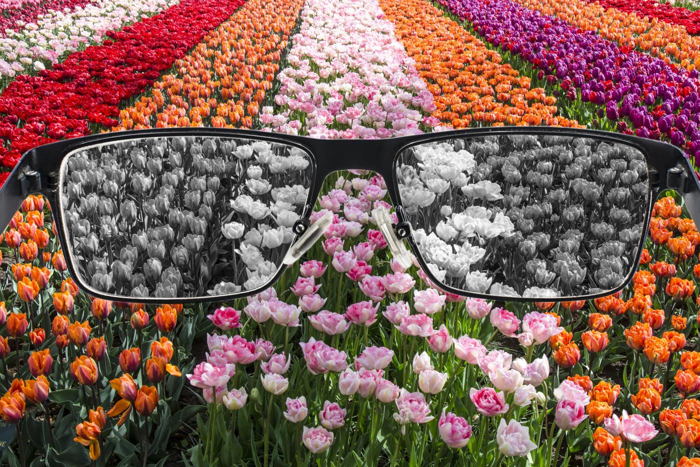
With these tools, you can change the colors on a webpage to see how it might look to a person with colorblindness. The images below show a landscape photo with the different color vision deficiency modes activated.
| Mode | Image |
|---|---|
Full Color (Trichromacy) is how most people see color. 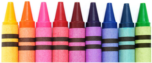
| 
|
Deuteranomaly is the most common form where red-green starts to blend and colors become muted. 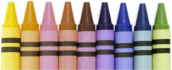
| 
|
Deuteranopia is a more extreme version of red-green color blindness where greens are very hard to distinguish from reds. 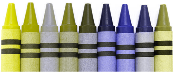
| 
|
Protanopia is another red-green color blindness form where bright red colors tend to look dark, almost black. 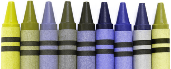
| 
|
Tritanopia is a blue-blindness, where blues (especially bright blues) look more green. 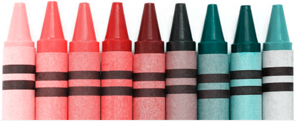
| 
|
Monochromacy/Achromatopsia is an extremely rare condition (0.0001%) where the person sees in shades of gray. 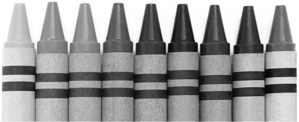
| 
|
It's astonishing to rediscover the web this way. Try the color blindness simulator with any web pages you've created. Do an image search and try the simulator on:
- ripe and unripe tomatoes
- a bottle of ketchup
- a box of crayons
- green grass
- your favorite sports team
You can also find mobile apps that apply these filters to your camera. Point your phone around your living room or back yard, and see how the colors change.
Flip through the filters and prepare to be perplexed! After you have this experience, you will be changed, and your awareness of other people's challenges will be that much more real to you.
Why It Matters: Color and Accessibility
When you use color in your designs, ask yourself:
If someone can't see this color, will they be able to understand the meaning of my content?
A colorblindness simulator can help you answer this question. It's an important question to ask because the answer impacts the accessibility of your content. The Web Content Accessibility Guideline, WCAG SC 1.4.1 (Use of Color), says color cannot be the only way of communicating information, since not everyone sees colors or sees them the same way.