
How to Create a Callout
-
1
Add Callout
- Add a new 1-Column Band to a Landing Page or Site Page.
- Inside the column, select the Add Component button.
- Select Callout from the Choose Component dialogue box.
-
2
Callout Title and Image
- Callout Title - Appears at the top of the Callout box. Example: Usability Testing
- Select Add Media to place an image on the left side of the Callout.
Callout Example
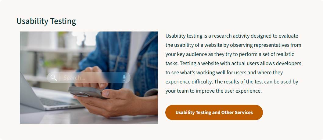
Example of a Callout component with a light background color advertises Usability Testing with a short description, link styled as a button, and a photo of a person using a mobile device. -
3
Callout Text and Links
- Callout Text - Enter the main text for the Callout. Example: "Usability Testing is a research activity..."
- Links can be added in the Callout Text as Text or Button Links.
Example Button Link
-
4
Callout Background Color and Heading Level
- Select the desired Callout Background Color. Your website's Color Palette determines the actual color of your Callout Background.
- Light
- Dark
- Select the appropriate Heading Level. The default is H3.
- Note: On Site Pages with the On This Page menu enabled, using H2 causes the Callout to appear in the menu.
Dark Background Color Example
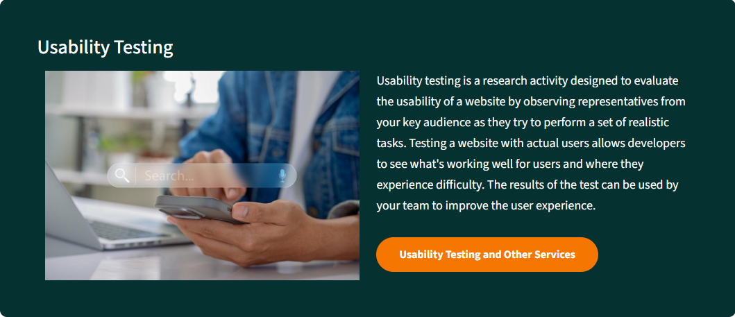
Example of a Callout component with a dark background color advertises Usability Testing with a short description, link styled as a button, and a photo of a person using a mobile device. - Select the desired Callout Background Color. Your website's Color Palette determines the actual color of your Callout Background.
This page was last modified on 09/22/2026