How To
-
1
Create a Landing Page
New Content Types are created using the Content menu in your toolbar. To create a new Landing Page, navigate to: Content > Add Content > Landing Page.
Begin filling out the form. Fields marked with an asterisk (*) are required.
- Title (*) - Enter the page name here. It appears in the browser's address bar and forms the URL so it should be brief. The optimal title length is less than 60 characters, including spaces. Include important keywords in the title to improve the search results. This appears on the Landing Page and in its URL.
- Hide Title on Page - If desired, check the box to hide the title on the page.
-
2
Main Image
If a Main Image is added to the Landing Page, it appears at the top of the page. The page's Title is overlaid on top of the image in the bottom left corner. A drop shadow is added to the text and a transparent overlay darkens the image to enhance the readability of the text. Learn about Color Contrast for Digital Accessibility.
Note: A Main Image is required if you wish to enable the Home Page Search Block with Popular Topics on your Home Page.

Example: A Landing Page with a Main Image. If a Landing Page has no Main Image, a light-colored background is applied behind the Page Title to draw attention to it:

Example: A Landing Page without a Main Image. Dimensions and Resolution
The ideal dimensions for a Landing Page Main Image are 2880px wide x 1254px high. This is true whether or not there is a search box or Hero Image, as is often the case with Home Pages. The recommended minimum resolution is double the desktop view size for clearer, better-looking images on high resolution screens. Download an image to use as a template.
Note: Do not put important content in the bottom left corner of the image. The platform places the Page Title on top of the image in this corner and will obscure content.
Alternative Text
All meaningful images must have descriptive alternative text (alt text) to be accessible for visitors with low or no vision. If the image does not convey meaningful information and is purely decorative, check the box for Decorative Image and leave the Alternative Text field empty. This allows screen reading software to skip over the image. Learn more about Alternative Text.
- Main Image - Select the Add Media button to add a Main Image.
- The Media Library opens. Select the desired image, or upload a new image and select it.
- Select Insert Selected.
- A thumbnail of the image you selected now appears.
Summary
- Summary - Briefly describe the contents of the Landing Page. The Summary appears in search engine results with the link. Provide a Summary to enhance Search Engine Optimization (SEO). Note: When left blank, the Summary field uses an excerpt from the Page Content as the summary.
-
3
Create and Customize a Band
Create new Band
Page content is organized using Bands. The page must have at least one band. Landing Page Bands may contain up to four columns. Add as many Bands as you desire; bands stack one on top of the other. See the Bands Help Topic.
- In the Bands section, insert a Band. Select the Add button, indicated by a blue square containing a white plus sign.
- A dialogue box appears, prompting you to Create new Band. Only the Column Layout is required. You may choose to customize a variety of settings:
- Band Title
- Column Layout*
- Background Image
- Text Color
- Size - Padding
- Size - Width
- Size - Statistic Card
 Accordion
Customize Band Settings
Tab/Accordion ItemsText entered in this field appears across the top of the band, centered horizontally and styled as Heading 2. The default text color is a dark color from your website's Color Palette that is readable against the white background. This color can be customized under the Text Color option. Learn about Color Contrast for Digital Accessibility.

Band Settings Example: Band Title centered at top of band; Layout 2 Column (2/3 - 1/3); No background image; Text color None; Padding Medium top/bottom padding; Width None; Statistic Size None. Text component in 2/3 column on the left. Profile Card component in the 1/3 column on the right. The column layout you select when inserting a Band determines which content Components you may insert. Some Components are better suited to wider columns, while others are better suited to narrower columns.

Example: The 1 Column layout is selected. - Select the desired layout*. There are six column layout options to choose from:
- One column
- Two columns, split evenly
- Two columns, one-third on the left and two-thirds on the right
- Two columns, two-thirds on the left and one-third on the right
- Three columns, split evenly
- Four columns, split evenly
- The remaining band settings are optional. Select Save to begin inserting Components into the band.
- To return to the Band Settings, select Edit indicated by the pencil icon on the Band Toolbar. See the Bands Help Topic.
Best Practices
Before selecting a background image, consider the content that the band will contain. If you plan to include a Text Component, ensure that the background image is not too busy with distracting elements. Adjust the Text Color as needed to provide readable contrast.
In this example, a background image of a mountain stream has been added to the band. The Text Color has been set to Light Text to make the Band Title and Text Component more readable, but still lacks sufficient contrast over some of the rocks and rapids. The Profile Card in the right column, however, is still readable and stands out against the background image. Suggested solutions include removing the background image, or using a different Component in the first column.

Band Settings Example: Band Title centered at top of band; Layout 2 Column; Background Image of a mountain stream; Text color Light Text; Padding Medium top/bottom padding; Width Limit Content to Large Width; Statistic Size None. Text component in column on the left. Profile Card component in the column on the right. 
- Select the Add Media button to add a background image to the band.
- Text Color - Choose a text color option:
- None - Default dark primary text color from your website Color Palette on a white background. May be compatible with a light background image; use discretion.
- Dark Text - Black text on the Secondary light background color from your website Color palette. May be compatible with a light background image; use discretion.
- Light Text - White text on the dark primary background color from your website Color Palette. May be compatible with a dark background image; use discretion. Example below.

Band Settings Example: Band Title centered at top of band; Layout 2 Column (2/3 - 1/3); No background image; Text color Light Text (automatically adds a dark background color from your website Color Palette); Padding Medium top/bottom padding; Width Limit Content and Background to Large Width; Statistic Size None. Text component in 2/3 column on the left. Profile Card component in the 1/3 column on the right. Padding creates space vertical white space above and/or below the Component inside the Band. Larger padding allows content to "breathe" and helps the visitor focus on different pieces of content. Smaller padding brings similar content closer together, helping the visitor understand their relationship. Experiment with the padding of each Band stacked on your page to achieve the desired appearance.
White space is not necessarily white in color. If you add a Background Image, the image will fill the padded area. Likewise, if you select the Light Text Color, the padding will be the dark primary background color from your website Color Palette. For example, the image below shows a Light CTA Card inside a Band. The Text Color is light so the background is dark green. As the padding size is increased, the green background grows taller.

Above: A light CTA card sits inside a band with a dark green background color. Padding increases from left to right, illustrating the drop-down menu options. 
Medium top/bottom Padding is the default setting. To change the padding, select the desired setting from the drop-down menu.
- None
- No Top/Bottom Padding
- Small Top/Bottom Padding
- Medium Top/Bottom Padding (Default Setting)
- Medium Top Padding Only
- Medium Bottom Padding Only
- Large Top/Bottom Padding
- Large Top Padding Only
- Large Bottom Padding Only
You can specify how wide the Band and its content appear on the page. The default setting for Band Width is Standard-Width Content, Full-Width Background.
Width Options and Appearance
- Standard-Width Content and Background - Both the Band's background and the content contained within the Band are constrained to the Standard Width. (Top Band in Example 1 image).
- Standard-Width Content, Full-Width Background - Only the content is constrained to the Standard Width, but the Band's background spreads across the full width of the page. (Default; Middle Band in Example 1 image).
- Full-Width Content and Background - Both the Band's background and the content contained within the Band will spread across the full width of the page. (Bottom Band in Example 1 image).
Example 1

Each of the Bands above contain the same content and use all the same settings, except for Band Width. The Band Width settings from top to bottom are: Standard-Width Content and Background; Standard-Width Content, Full-Width Background; Full-Width Content and Background. Example 2

Band Settings Example: No Band Title; Layout 2 Column (2/3 - 1/3); Background Image of a Blue Ridge mountain vista; Text color Light Text; Padding Large top/bottom padding; Width Limit Content to Large Width; Statistic Size None. Text component in column on the left contains a Heading 2, brief text and a .jpg image of a downloadable coloring page with Smokey the Bear. Text component in the column on the right contains a .png image of the U.S. Forest Service logo. -
4
Add Components
Best Practices
Write for your audience's needs in plain and direct language. Not sure where to begin? Use a tool to help simplify your writing, such as the Hemingway Editor, and consider our Writing for the Web training.
Components
You can add different types of content to the page by adding Components. Do not stack multiple Components within a single column- each Band column should contain only one component. Explore examples of all Components.
- Select the Add Component button, indicated by a gray square containing a plus sign.
- A dialogue box appears, prompting you to Choose a Component. The column layout you selected when inserting a Band determines which content Components you may insert.
- Select the desired Component and provide the appropriate content. Each Component has its own Help Topic for guidance.
- Repeat these steps as needed to add the desired number of Bands and content Components to the page.
AccordionComponent Options by Column Layout
Tab/Accordion Items
This column size can contain the following Components:
- Article Card
- Carousel
- Contact Card
- CTA Card
- Event Card
- iFrame
- NC Map
- Quick Links
- Spotlight
- Statistic Card
- Tabs/Accordion
- Text
- Video Card
- View Embed
- Webform Embed

This column size can contain the following Components:
- Article Card
- Contact Card
- CTA Card
- Event Card
- Heading Title
- iFrame
- NC Map
- Profile Card
- Quick Links
- Spotlight
- Statistic Card
- Tabs/Accordion
- Text
- Video Card
- View Embed
- Webform Embed
1/3 Column Component Options 2/3 Column Component Options 
This column size can contain the following Components: Article Card, Contact Card, CTA Card, Event Card, Heading Title, Profile Card, Quick Links, Statistic Card, Text, Video Card, View Embed, Webform Embed. 
This column size can contain the following Components: Article Card, Contact Card, CTA Card, Event Card, Heading Title, iFrame, NC Map, Profile Card, Quick Links, Statistic Card, Tabs/Accordion, Text, Video Card, View Embed, Webform Embed. 
This column size can contain the following Components:
- Article Card
- Contact Card
- CTA Card
- Event Card
- Heading Title
- iFrame
- Profile Card
- Quick Links
- Statistic Card
- Text
- Video Card
- View Embed
- Webform Embed

This column size can contain the following Components:
- Article Card
- Contact Card
- CTA Card
- Event Card
- Heading Title
- Profile Card
- Quick Links
- Statistic Card
- Text
- Video Card
-
5
Home Page Popular Topics
This section only applies if the Landing Page you are editing is your website's Home Page and the Home Page Search Block is enabled. Disregard this section if you are not editing your Home Page.
Get Help with Home Page Popular Topics
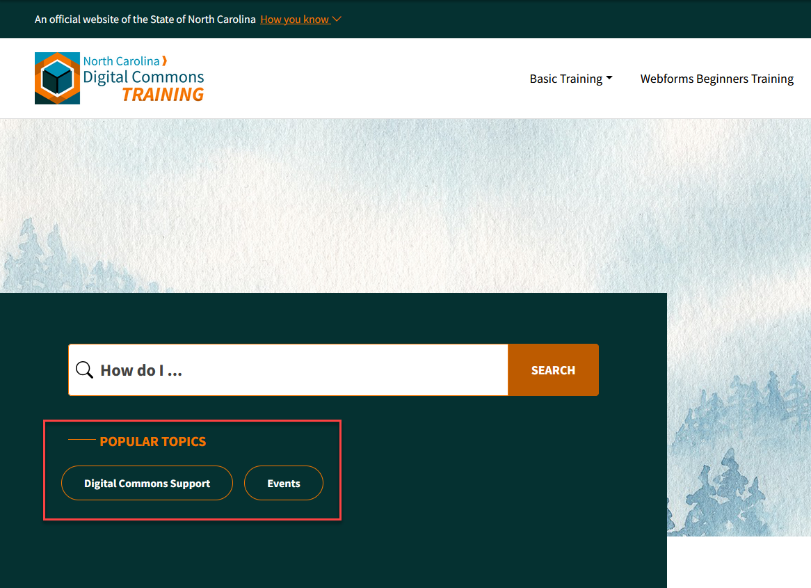
Example: When you add Home Page Popular Topics, they appear beneath the search bar of your Home Page Search Block. -
6
Menu Settings and Navigation
Main Menu
To add this page to the Main Menu, follow Step 2 of the Menu Structure & Navigation Help Topic.
-
7
Save
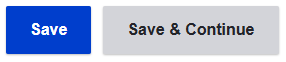
Save Button - Save your work and reload the page to the public version.
Save & Continue Button - Save your work and stay in editing mode to continue working.
Save often as you work on your content to avoid losing work due to timing out or navigating away from the page.
- Editors may only save as "Draft" or "Needs Review."
- Publishers and Web Manager may also save as "Published."
Current State: Displays the current status of the Content Type and whether or not it is available to the public.
Change to: The state you want the content to be in the next time you select the Save button.
- Draft - All new content types are in Draft State by default. This state allows you to continually edit and save your work before it is made available to the public.
- Needs Review - Editors may save as Needs Review when they are finished working and want a Publisher or Web Manager to publish the content.
- Published - This content is available to the public. Only a Publisher or Web Manager can choose this state.
- Unpublished - This content was available to the public at one time, but is not now. Only a Publisher or Web Manager can choose this state.
Delete: Deleted Content Types cannot be recovered. If you may need this content again in the future, it is best to change the state to Unpublished.
This page was last modified on 07/10/2026