How To
-
1
Add Article Card
Inside a Band
- Add a Band with the desired number of columns to the page.
- Inside a column, select the Add Component button.
- Select Article Card from the Choose Component dialogue box.
Inside a Tabs/Accordion
- Expand Advanced Settings.
- Choose the desired Sidebar:
- First Sidebar content appears before the Item Text of the Tabs/Accordion Item.
- Second Sidebar content appears after the Item Text of the Tabs/Accordion Item.
- Select the caret to expand the Component menu.
- Select Add Article Card.
-
2
Main Image
The Main Image is optional but is recommended because it helps draw attention to the Article Card. The ideal image dimensions for an Article Card depend on whether you want the image to be landscape, portrait, or square. You also have the option of using this image as the Background Image behind the Article Card Title in the Advanced Settings.
- Select Add Media.
- Select an existing image file from the Media Library, or
- In the Add or Select Media dialog box, select Choose File to upload a new image file.
- Insert Selected
- A thumbnail image of the image file you selected appears.
- Select Add Media.
-
3
Article Card Title and Link
Fields with an asterisk (*) are required.
- URL (*) - Enter an address for the link. Options:
- Internal Links - For links to pages on your website, you can:
- enter <front> to link to the Home page.
- search for the page Title to find and select it.
- enter an internal path (such as /news/press-releases).
- External Links - For links to pages on a different website, paste the full URL (Example: http://digitalcommons.nc.gov)
- Internal Links - For links to pages on your website, you can:
- Link Title (*) - Enter the text to display for the link.
- Title Heading Level (*) - Adjust the heading as needed. The default setting is H3.
- URL (*) - Enter an address for the link. Options:
-
4
Description and Published Date
- Description - Help visitors decide if they want to read the article. Enter a description to display on the Article Card.
- Published Date - Display a date on your Article Card. Enter or select the date using the date picker.
-
5
Advanced Settings: Main Image
Background Image
If desired, you can set the Main Image as the background for the Article Card Title. You may need to darken the background image to provide enough contrast for the Title to be readable.
Select the desired checkbox(es):
- Use Main Image as Background - Overlays title on top of main image background.
- Darken Background Image - Increases contrast between title and background image.
Image Style
If desired, select an Image Style from the drop-down menu to change the aspect ratio of your image:
- Rectangle
- Portrait
- Square
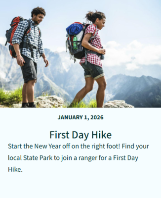
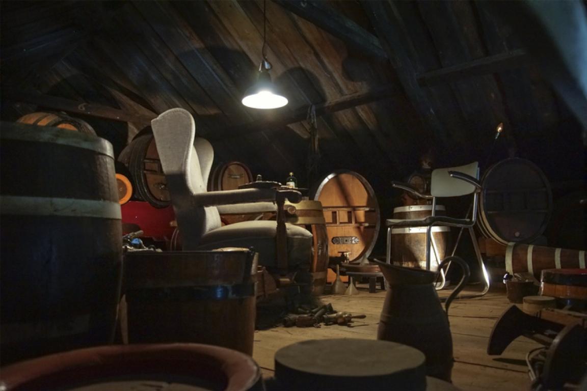
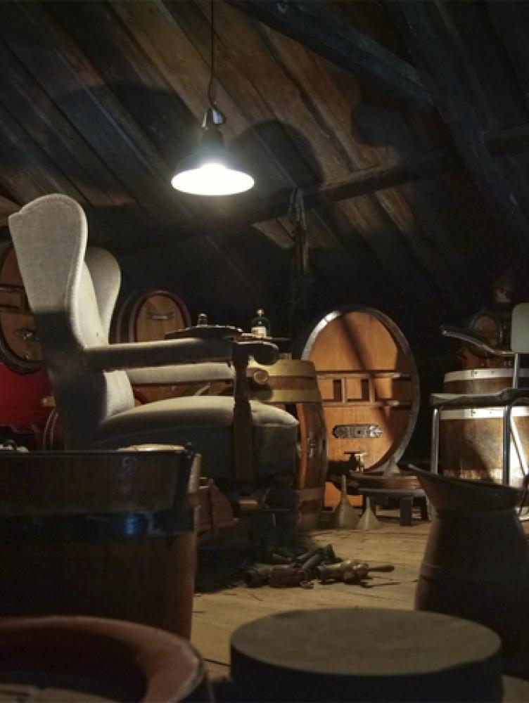
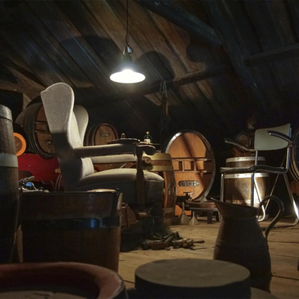
Examples of Main Image Styles
-
6
Advanced Settings: Background Colors
Actual colors are determined by the color palette your website uses. The platform dynamically styles text to contrast with the selected background color for proper visual contrast.
Card Background
This adds a solid color behind the Article Card Title. If desired, use the drop-down menu to select a color:
- No Color - White background.
- Accent Background - The accent color appears behind the Title.
- Dark Background - The primary background color appears behind the Title.
- Light Background - The secondary light background color appears behind the Title.
Description Background
This adds a solid color behind the Description on the Article Card. If desired, use the drop-down menu to select a color:
- No Color - White background.
- Accent - The card is the accent color behind the description.
- Dark - The card is the primary background color.
- Light - The card is secondary light background color.
Examples of Background Combinations
-
7
Advanced Settings: Height
Card Height
Choose a Card Height for the Article Card. The default value is 270 pixels. Other preset height options are:
- 210 px
- 240 px
- 270 px
- 300 px
Height Override
For a custom Card Height, enter a number for the height in pixels. The value entered in this field overrides the height value set in the Card Height menu.
Note: When an Article Card is placed inside a band, the height is overridden and set to match the tallest item in the band for visual consistency.
Examples of Article Card Heights
-
8
Save
Select the Save button to save the page and view results.

